Background
When the baby was born, I championed the installation of a new ‘Smart’ heating system. Our house is very much one that jack built, and the temperature can vary widely between rooms based on things like wall/window quality, wind, sunlight. It’s very useful to be able to control the radiators in each room based on what the room needs, rather than centrally applying a schedule, and trying to tweak the radiators.
I opted for Tado, based on a few factors. I’m not 100% sure it was the best option, but it’s really improved the balance of heating across the house. One of the reasons I chose Tado was the ability to query and make changes via the API.
The problem
“Won’t the baby get cold?”
It’s a throwback to an old technology, those of us born before digital stuff became so cheap are very used to anachronisms like turning the heating up higher to ‘make it warm up faster’. I’m keen to find a way to use the API to demonstrate to my wife that the baby’s room is
- The right temperature
- Below the heating capability of the system (i.e. if we had a blizzard, the radiator could call on extra heat to cope)
- There’s no need to change the settings
The steps
- Get data from the Tado API
- Format it into something useful
- Decide how to visualise it
1. Get data from the Tado API
I’ve done some messing with Tado before, and I made another post about automating the getting of a bearer token for access, based on some environment variables with my credentials. Given that, and the limited knowledge of the APIs contents, gleened from much googling, I created the following methods:
    def getTadoHome(): #From our auth credentials, return the homeId
        response = requests.get('https://my.tado.com/api/v1/me', headers={'Authorization': 'Bearer'+auth.returnTadoToken()})
        return response.json()['homeId']

    def getTadoResponse(zoneId, date): #Return a response object for the given zone, on the given day
        endPoint='https://my.tado.com/api/v2/homes/'+str(getTadoHome())+'/zones/'+str(zoneId)+'/dayReport?date='+str(date)
        response = requests.get(endPoint, headers={'Authorization': 'Bearer '+auth.returnTadoToken()})
        return response

    def getTadoRoomTempReport(response):
        response=json_normalize(response.json()['measuredData']['insideTemperature']['dataPoints'])
        roomTemp_df=pd.DataFrame(response)
        roomTemp_df['timestamp']=pd.to_datetime(response.timestamp, format='%Y-%m-%d %H:%M:%S.%f')
        return roomTemp_df

#shortened
Tado lumps up a bunch of the data you need to review a large chunk of time into a single ‘dayReport’ – a monstrous object which is really unpleasant to parse. I’ve solved the problem bluntly by pulling a single dayReport and then passing it to other functions which cut it up.
I’ve also take the time to cut out and rename columns to make them a bit easier to use later. A frustration is how verbose this syntax is in python. A simple rename goes from
select roomheating.from_ts as from
to (what feels like an unecessary):
roomHeating_df.rename(columns={'from': 'from_ts'}, inplace=True)
It’s made more frustrating by having to separate out my renames from my dropping of columns – which can’t be a simple ‘keep’ like in SQL or SAS
2. Format it into something useful
My lack of familiarity with Python, and Pandas specifically might be showing here. I’ve got some datasets which are roughly indexed on time, and I want to join them. I could reflex some SQL to solve this.. but that won’t teach me anything.. so the first step is to think about the data I’m going to merge


again, this kind of merge in SQL would be easy, but after some googling I’ve got an equivalent Pandas syntax:
df_merge=pd.merge_asof(roomTemp_df,roomHeating_df, left_on="timestamp", right_on="from_ts", direction="backward")
Which produces what I’m after, well sort of

Again, I don’t like how verbose this is making a simple join – I’m going to have to do this a few times for each join I want, and it *feels* clunky. I also dislike how it’s keeping all my columns, especially the horrible datatimes
3. Deciding how to visualise it
3a. A rant
Packages are a necessary evil of an open source language which boasts the flexibility of Python, but it comes at a cost. There are a colossal number of ways to do anything, and because they’re all optimised for slightly different end goals, they all work a bit differently.
I’m trying to draw a graph. I want to do this as easily as possible but I’ve no idea where to start, or at least where *best* to start.
3b. Getting on with it
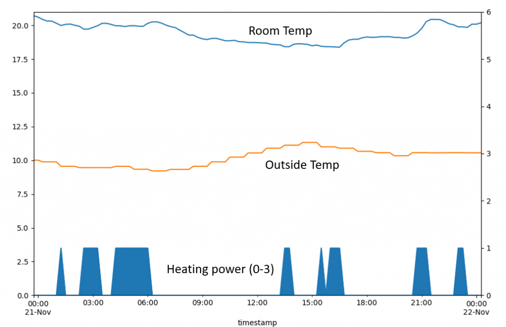
Ok, back to the task. I’ve gone with Matplotlib, largely thanks to google. Here’s a basic plot showing the room temp, external temp, and a measure of the amount of heating power being supplied to the room

This is pretty good – I’ve got the data for a single day, and by converting the heating power value to an integer (from None, Low, Med, High), I can make it clear what’s happening.
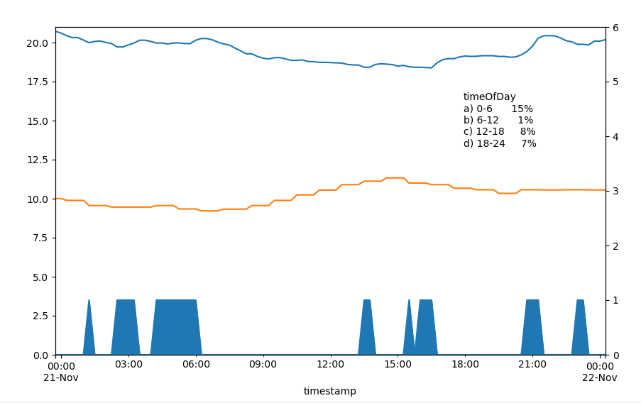
First thing to notice is how little heating power is needed to maintain a fairly even room temperature. There’s definitely more capacity in the system. If the system was running at full power all day it would give an average power of 3. With a bit of work to split up the day into 4 time zones:

I can see the amount of power being used to keep the room warm – midnight to 6 am is the worst spot, where we’re using 15% of maximum heating we could give.
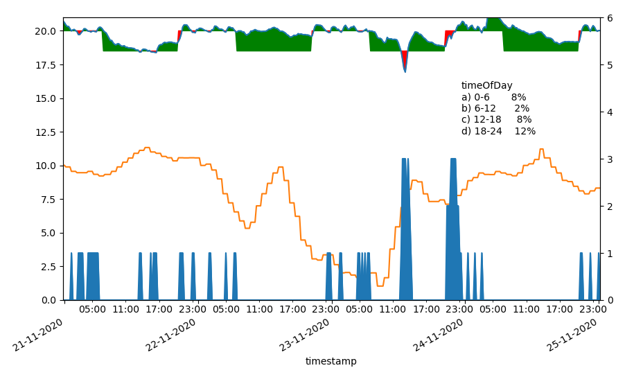
The top line is a bit misleading as it’s not clear that the thermostat is set for different temperatures throughout the day. With a big of clever colour-fill, I can show visually when things are working as they should

So there we go – the baby is warm enough, and the heating has plenty of capacity to handle a cold spell!